Blog Details 
The Evolution of Responsive Design: Beyond Screen Size Adaptation | ATMOSYN
How responsive design has evolved from simple screen size adaptation to a comprehensive approach addressing device capabilities, user preferences, and accessibility standards.
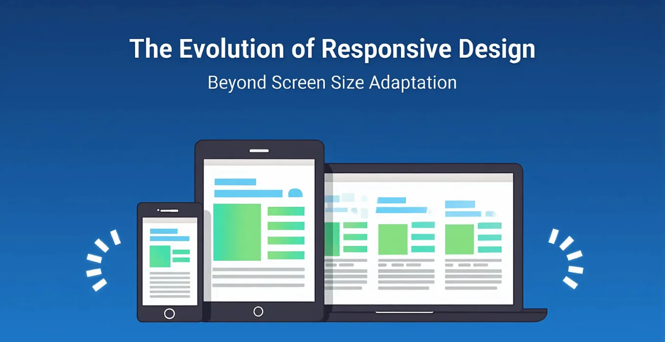
Responsive design has evolved far beyond simply adapting layouts to different screen sizes. In today's complex digital landscape, it now encompasses a broader approach that considers various device capabilities, user preferences, and accessibility standards to create seamless and personalized experiences across a wide range of devices. What began as a method to make websites work on mobile phones has transformed into a sophisticated framework that addresses the ever-expanding ecosystem of devices and user needs.
Modern responsive design integrates context awareness, adapting not just to screen dimensions but also to user behavior patterns, device capabilities like processing power and input methods, connection speed variations, and individual accessibility requirements. This evolution reflects our growing understanding that truly effective digital experiences must be flexible enough to serve users regardless of how, when, or where they access content.
1. The Responsive Design Evolution
Responsive design now adapts to devices, preferences, and accessibility, creating seamless experiences for all users.

- Original responsive design focused primarily on flexible layouts that adjusted to viewport sizes
- Modern approaches now consider device capabilities beyond just screen dimensions
- User preferences like dark mode, reduced motion, and font size preferences are now factored into responsive systems
- IoT devices and non-traditional screens have expanded the definition of what responsive design must address
- Designers now build systems rather than individual layouts to accommodate the vast device ecosystem
- Responsive design has evolved from a technical solution to a comprehensive user experience philosophy
2. Foundational Elements
Fluid grids and flexible images ensure content adapts to any screen size or orientation.

- Fluid grids using relative units like percentages and viewport widths remain essential for flexible layouts
- Flexible images that scale proportionally prevent visual distortion across different screen sizes
- CSS Grid and Flexbox have revolutionized how we implement responsive layouts with fewer workarounds
- Relative sizing ensures consistent proportions regardless of screen dimensions
- Art direction techniques allow different images to be served based on screen context
- SVG graphics provide resolution-independent visuals that scale perfectly across all devices
- Picture and srcset elements enable optimized image delivery based on device capabilities
3. User-Centric Approaches
Modern responsive design prioritizes user needs, context, and personalization for better experiences.

- Response to user behavior patterns and preferences creates more relevant experiences
- Content prioritization ensures the most important information is readily accessible
- Context-aware designs adapt based on location, time, and user history
- Personalization layers customize experiences based on individual user data
- Content is structured to be consumable in different formats across different contexts
- Micro-interactions provide feedback that works across different input methods
- User testing across multiple devices validates effectiveness of responsive approaches
- Analytics inform ongoing refinement of responsive behavior based on actual usage patterns
Behind every seamless user experience is thoughtful code that balances performance, scalability, and maintainability.
4. Responsive vs. Adaptive Approaches
Responsive uses fluid layouts; adaptive uses multiple fixed layouts. Many sites combine both for optimal results.

- Responsive design uses fluid grids that continuously adapt to any screen size
- Adaptive design creates distinct layouts for specific breakpoints and serves the appropriate version
- Hybrid approaches leverage advantages of both methods for optimal user experience
- Server-side adaptation can deliver tailored experiences based on device detection
- Progressive web apps bridge the gap between responsive websites and native applications
- Component-based design systems enable consistent experiences across different contexts
- The choice between responsive and adaptive depends on project requirements, target audience, and technical constraints

Key Takeaways
- Responsive design now encompasses device capabilities, user preferences, and accessibility needs
- Fluid grids and flexible images remain foundational but are enhanced by CSS Grid and Flexbox
- Advanced media queries enable designs to respond to far more than just screen dimensions
- Performance optimization is now considered central to responsive design strategy
- Accessibility features are integrated throughout the responsive design process
- User-centered approaches prioritize human needs over technical implementation
- Modern systems often combine responsive and adaptive techniques for optimal experiences
Frequently Asked Questions
Modern responsive design now considers factors beyond screen dimensions, including device capabilities (processing power, input methods), user preferences (dark mode, reduced motion settings), connection speed, accessibility requirements, and contextual factors like user location and behavior patterns. It's evolved from a purely technical approach to a comprehensive design philosophy centered on delivering optimal experiences across all contexts.
While both approaches create websites that work across different devices, responsive design uses fluid grids and flexible layouts that continuously adapt to any screen size using CSS media queries. Adaptive design, in contrast, creates several distinct layouts for specific screen sizes and serves the appropriate version based on device detection. Many modern sites use a hybrid approach, combining the strengths of both methods.
Performance is now considered a core component of responsive design. Techniques like responsive images, conditional loading, critical CSS, and lazy loading ensure that sites load quickly across all devices. This is particularly important for users on mobile devices with limited data plans or slower connections. Performance budgets and metrics help ensure that responsive sites remain fast regardless of context.